CS 211 Lesson 17
Advanced Plotting
Quote:
True genius resides in the capacity for evaluation of uncertain, hazardous, and conflicting information. Winston Churchill
Lesson Objectives:
Be able to graph data as bar and pie charts
Be able to graph data as histograms
Be able to graph functions of two independent variables using 3-D plots
Be able to graph data as 3-D mesh, surface, and contour plots
Lesson:
I. MATLAB Concepts
A. Plotting overview (review from last lesson)
MATLAB has an extensive set of plotting functions. We will only present an overview of MATLAB's capabilities. If you are interested in learning all of the possible plotting features in MATLAB, search for "Specialized Plotting" in MATLAB's help system.
MATLAB functions for generating plots (a subset)
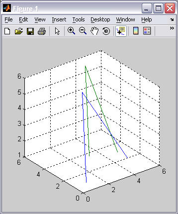
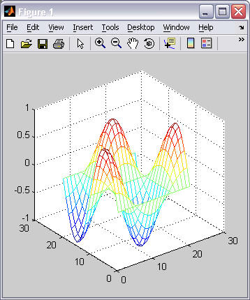
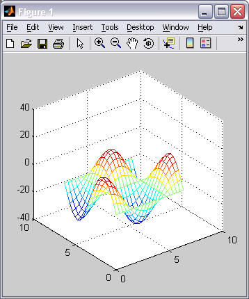
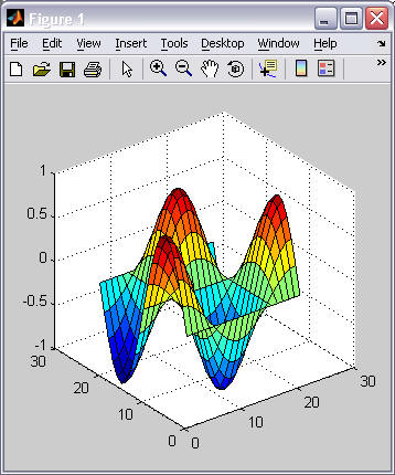
Plot type 2D Plots 3D Plots line graphs plot(), ezplot(), fplot()
semilogz(), semilogy(), loglog()plot3(), ezplot3() scatter plots (graph) scatter() scatter3() histograms (graph) hist(), histc() bar charts bar(), barh() bar3(), bar3h() pie charts pie() pie3() surface plots (graph) surf() mesh plots (graph) mesh() contour plots (graph) contour() contour3()
- This lesson will concentrate on the plotting of commonly used graphs and charts.
B. Pie Charts
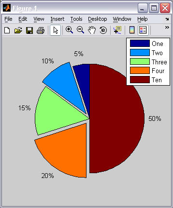
- The pie() function will create a pie chart that represents the percentages of the whole from a row vector of data values. The pie() function calculates the sum of all values in the vector and then divides each individual value by this sum to calculate the percentage of each value in the vector.
Example 1 Example 2 % pie(vector) pie( [1 2 3 4 10] )
legend('One', 'Two', 'Three', 'Four', 'Ten')% pie(vector, exploded) pie([1 2 3 4 10], [0 1 0 1 0])
legend('One', 'Two', 'Three', 'Four', 'Ten')B. Bar Charts
- The bar() and barh() functions will create a bar chart. Bar charts are typically used to represent the comparison of discrete categories of data. To label the bars in the chart requires the use of the set() and gca() functions in combination with the 'XTickLabel' axes property. These functions will be described in more detail later in the course. For now, just use the example statements shown below and modify the labels as needed.
Example 1 Example 2 % bar(vector) bar([23 34 12 45]);
set(gca(), 'XTickLabel', ...
{'DFC', 'DFMS', 'DFM', 'DFCS'});
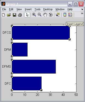
% barh(vector) barh([23 34 12 45]);
set(gca(), 'YTickLabel', ...
{'DFC', 'DFMS', 'DFM', 'DFCS'});
- If you are comparing multiple values for each discrete category, provide a 2D matrix for the bar() function, where the multiple values for each category are in the same row of the 2D array. Refer to the examples below.
Example 3 Example 4 % bar(matrix) bar([23 24 27; ...
34 33 37; ...
12 13 10; ...
45 44 50]);
set(gca(), 'XTickLabel', ...
{'DFC', 'DFMS', 'DFM', 'DFCS'});
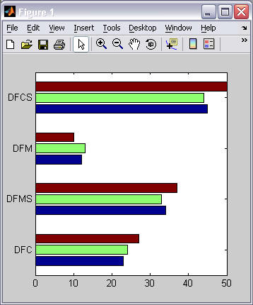
% barh(matrix) barh([23 24 27; ...
34 33 37; ...
12 13 10; ...
45 44 50]);
set(gca(), 'YTickLabel', ...
{'DFC', 'DFMS', 'DFM', 'DFCS'});
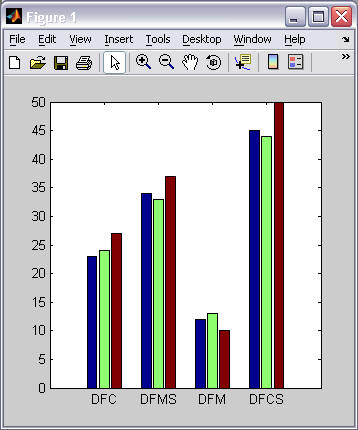
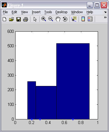
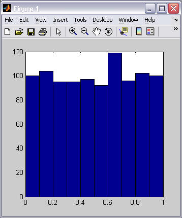
C. Histograms (graphs)
- The hist() function will create a histogram -- a graph of the distribution of values within a data set.
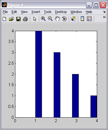
Example 1 Example 2 % hist(vector) hist( [1 2 3 4 1 2 3 1 2 1] );
% hist(vector) hist( rand(1,1000) );
- The number of groupings (called bins) used for a histogram distribution can be specified in one of two ways:
- How many bins to use.
- A vector that specifies the "center point" of each bin. (The limits of each bin is determined by the half-way points between each specified "center point". The first and last bin is always symmetrical around its "center point" -- which may exclude values in the lower and upper ranges of your data if the bins are not equally spaced. If you specify a "center point" vector, you typically want the "center points" to be symmetrically spaced along the horizontal axis.)
Example 1 Example 2 % hist(vector, number_of_bins) hist( [1 2 3 4 1 2 3 1 2 1], 2 );
% hist(vector, vector_of_bin_center_pts) hist( rand(1,1000), [0.2 0.3 0.7] );
D. Scatter plots (graphs)
- The scatter() function will create a scatter plot -- a graph of two independent variables. The marker_type is specified using the same character codes as the marker types in a linespec (refer back to lesson 16).
Example 1 Example 2 % scatter(x_vector, y_vector) scatter( [1 2 3 4], [5 2 7 3] );
axis( [0 5 0 8] );
% hist(x_vector, y_vector, marker_type) scatter( [1 2 3 4], [5 2 7 3], '^' );
axis( [0 5 0 8] );
E. 3-D plots
- The plot3() function draws 3-D line plots.
- If the function receives three, equal-sized row vectors, (x, y, z), it will draw a single 3-D "curve" by drawing a line segment between each successive point. That is, it will draw lines from (x(1),y(1),z(1)) to (x(2),y(2),z(2)), then from (x(2),y(2),z(2)) to (x(3),y(3),z(3)), etc..
- If the function receives three, equal-sized matrices, (x, y, z), it will draw a separate "curve" for each column of the matrices, and the number of rows in the matrices determines the number of points that define each "curve". For example, if the matrices have 5 columns and 100 rows, then the plot() function will draw 5 lines, each defined by 100 points.
Example 1 Example 2 % plot3(vector, vector, vector) t = 0:pi/50:10*pi;
plot3(sin(t),cos(t),t);
grid('on');% plot3(matrix, matrix, matrix)
plot3( [1 2; 3 4; 5 5], ...
[1 2; 4 5; 2 3], ...
[1 2; 5 6; 1 1]);
grid('on');
- The mesh() function draws a set of inter-connected rectangles referred to as a "mesh".
- If the function receives one, 2-D array, it will generate its own regular spaced x-y grid and use each point in the supplied matrix as a height value on the grid. (The x-y grid will have the same size as the dimensions of the 2-D array with an increment of 1 unit between grid points. Note that in example 1 below, the vector t contains 20 values and the x-y grid is 20 by 20.)
- If the function receives three, equal-sized 2-D matrices, (x, y, z), it will draw a point at every (x(j),y(j),z(j)) data location and connect it to adjacent points to form rectangles. You can use the meshgrid() function to generate a regular grid of x-y points, as shown in example 2 below. Notice that the x-y axes go from 0 to 2pi.)
Example 1 Example 2 % mesh(matrix) t = 0:pi/10:2*pi;
heights = sin(t)'*cos(t);
mesh(heights);
grid('on');% mesh(x_matrix, y_matrix, z_matrix)
[x y] = meshgrid(0:pi/10:2*pi);
heights = sin(x)'*cos(x);
mesh(x, y, heights);
grid('on');
- The surf() function draws a surface made up of inter-connected rectangles. It works exactly like the mesh() function, except it draws solid rectangles (not just the rectangle outline.)
Example 1 Example 2 % surf(matrix) t = 0:pi/10:2*pi;
heights = sin(t)'*cos(t);
surf(heights);
grid('on');% surf(x_matrix, y_matrix, z_matrix)
[x y] = meshgrid(0:pi/10:2*pi);
heights = sin(x)'*cos(x);
surf(x, y, heights);
grid('on');
- The contour() and contour3() functions draw isolines from a height map. Isolines are lines that connect points of the same height.
Example 1 Example 2 % contour(matrix) t = 0:pi/10:2*pi;
heights = sin(t)'*cos(t);
contour(heights);
grid('on');% countour3(x_matrix, y_matrix, z_matrix)
[x y] = meshgrid(0:pi/10:2*pi);
heights = sin(x)'*cos(x);
contour3(x, y, heights);
grid('on');F. Plot manipulation and queries
- You can interactively manipulate and query plots using the following tool bar commands:
Select an individual line of the graph. Zoom in on a plot (the location of the cursor when you click it will determine the center of the zoom). Zoom out on a plot (the location of the cursor when you click it will determine the center of the zoom). Pan a plot -- moves horizontally and vertically. Rotate a plot. Query individual point values in a plot.
II. Good Programming Practices
BEFORE you plot any data, decide what relationships of the data you desire to present graphically. THEN choose the correct type of graph based on those relationships.
Desired presentation | Correct type of plot |
data changes over time | line plot |
two independent variables | scatter plot |
comparing values in discrete categories | bar chart |
percentages of a whole | pie chart |
frequencies or distributions | histogram |
III. Algorithms
(None for this lesson)
Lab Work: Lab 17
References: Chapman Textbook: sections 5.4-5.5