A. Plotting overview
-
MATLAB has an extensive set of plotting functions. We will only present an overview of MATLAB's capabilities. If you are interested in learning all of the possible plotting features in MATLAB, search for "Specialized Plotting" in MATLAB's help system.
-
We will cover two major topics in the next two lessons on plotting:
-
How to create a plot from a set of data.
-
How to set the attributes of a plot to get the appearance you desire.
-
-
Graphs vs. Charts
- A graph is a visual display
of the relationship between two or more variables. Each variable is
associated with an axis of the graph and the values vary
continuously over a range of values. Common types of graphs are
line graphs, scatter plots, and histograms.
- A chart is a visual display
of data where the horizontal (x) axis does not
represent a continuous variable, but rather a set of discrete
(non-continuous) values (e.g., USAFA academic departments: DFCS,
DFEE, DFAS, etc.). Common types of charts are bar charts and
pie charts.
- MATLAB does not make distinctions between graphs and charts -- BUT you
should make the distinction and use an appropriate plotting function
to accurately represent your data.
- A graph is a visual display
of the relationship between two or more variables. Each variable is
associated with an axis of the graph and the values vary
continuously over a range of values. Common types of graphs are
line graphs, scatter plots, and histograms.
- How can you choose an appropriate plot type
for a given problem? Ask yourself the following
questions and choose accordingly (recognizing that there are always
exceptions to these general guidelines).
Questions? If true, create a -- Is time one of my data values? Create a line plot.
(typically the x-axis represents time)Do I want to compare the relationship between two independent variables, apart from time? Create a scatter plot. Is one of my data variables discrete (not continuous over a range)? Create a bar chart. Am I plotting frequencies or distributions (i.e., how many times certain values occur within a data set)? Create a histogram. Am I plotting percentages? Create a pie chart. -
MATLAB functions for generating plots (a subset)
Plot type 2D Plots 3D Plots line graphs plot(), ezplot(), fplot()
semilogz(), semilogy(), loglog()plot3(), ezplot3() scatter plots (graph) scatter() scatter3() histograms (graph) hist(), histc() bar charts bar(), barh() bar3(), bar3h() pie charts pie() pie3() surface plots (graph) surf() mesh plots (graph) mesh() contour plots (graph) contour() contour3()
B. Line graphs using plot()
-
The plot(Xvalues,Yvalues) function is one way to create a line graph, where the two arguments are row vectors, both of the same size, that represent the (x,y) values to be plotted.
-
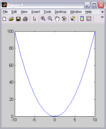
Plotting the function y = f(x) is typically a 3-step process:
Steps Example - Define a row vector of domain values.
- Create a row vector of the corresponding range values.
- Use the plot() function to graph the data points
x = -2*pi:0.1:2*pi;
y = sin(x);
plot(x,y) -
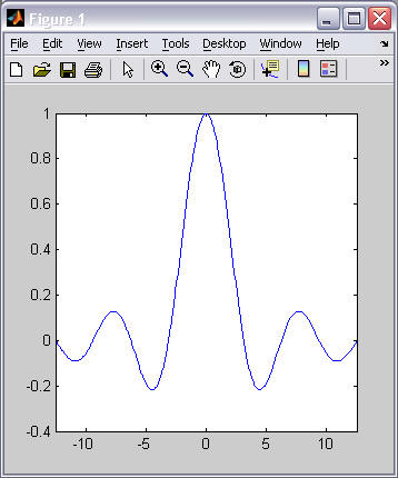
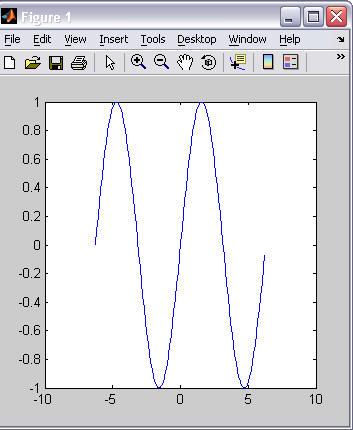
plot() draws a straight line between each adjacent point defined by the row vectors, i.e.,(x(1), y(1)), (x(2), y(2)), ... (x(end), y(end)). If your plot does not produce a smooth curve, add more points to your vector of x values. For example:
x = -2*pi:1:2*pi;
y = sin(x);
plot(x,y)x = -2*pi:0.1:2*pi;
y = sin(x);
plot(x,y)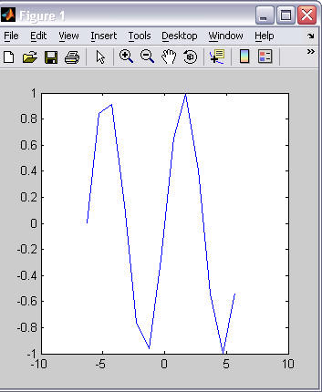
-
plot() draws into a "figure window." If no figure window is currently open, plot will create a new figure window to draw into. If a figure window is already open, plot() will replace the contents of the open figure window. Use the close() function to close a figure window.
-
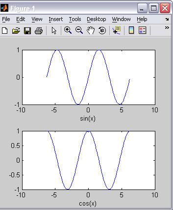
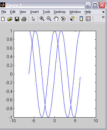
Multiple lines can be drawn onto a single graph (technically called an axes) in two ways:
- Include more than one pair of row vectors in a single call to plot(). For example:
- Use the hold('on') function call to keep subsequent plot commands drawing into the same axis (without replacing the existing graph). For example:
x = -2*pi:0.1:2*pi;
plot(x, sin(x), x, cos(x));x = -2*pi:0.1:2*pi;
plot(x, sin(x))
hold('on');
plot(x, cos(x));
-
A plot can be annotated in many ways. Some of the possible annotations are:
Annotation Examples Add a title title('x * sin(x)') Label the x axis xlabel('x'); Label the y axis ylabel('y'); Add a grid background grid('on'); Write text on the graph.
(The x, y location is specified in axes coordinates.)text(x, y, 'text');
text(0, pi, 'curve 1');Add a legend
(to label multiple plot lines)legend('sin(x)', 'cos(x)', 'tan(x)');
legend('sin(x)', 'cos(x)', 'Location', 'NorthEastOutside');
Valid locations include:
North, South, East, West,
NorthEast, NorthWest, SouthEast, SouthWest,
NorthOutside, SouthOutside, EastOutside, WestOutside, NorthEastOutside, NorthWestOutside, SouthEastOutside, SouthWestOutside,
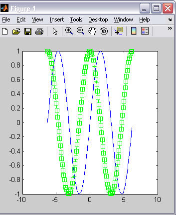
Best, BestOutside - A plot line's "style" can be modified with a linespec string.
A linespec string contains three code values that represent "line
style", "marker symbol", and color (in that order). The allowable codes
for each value are shown below:
Line Style Marker Symbol Color - Solid line (default) -- Dashed line : Dotted line -. Dash-dot line + Plus sign o Circle * Asterisk . Point x Cross s Square d Diamond ^ Upward triangle v Downward triangle > Right triangle < Left triangle p pentagram h hexagram (star) r Red g Green b Blue c Cyan m Magenta y Yellow k Black w White If you want each plot line to be unique, a linespec string should be passed to the plot() function for each pair of vectors. Your linespec string does not have to contain a code for all three attributes: "line style", "marker symbol", and color. If you leave one or more values out of the linespec string, the corresponding default value is used.
x = -2*pi:0.1:2*pi;
plot(x, sin(x), ':or', ...
x, cos(x), '--xb');x = -2*pi:0.1:2*pi;
plot(x, sin(x), ...
x, cos(x), '-sg');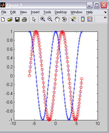
-
The length of the x and y axes is automatically set based on the minimum and maximum values in the x and y vectors graphed by plot(). You can manipulate the limits on each axis using the axis() function.
-
With no arguments, axis() returns a vector with the current plot's axes limits, in the order [xmin xmax, ymin, ymax].
Plot_limits = axis()
-
With a vector of four values as an argument, axis() sets the x and y limits of the current plot
axis([xmin xmax ymin ymax])
-