CSCE 120 Learning to Code: CSS - Cascading Style Sheets
CSS
Mr. Bert Bos, co-inventor of CSS
According to Mozilla Developer Network (MDN), Cascading Style Sheets (CSS) is a stylesheet language used to describe the presentation of a document written in HTML or XML (including XML dialects such as SVG, MathML or XHTML). CSS describes how elements should be rendered on screen, on paper, in speech, or on other media.
CSS is the technology responsible for creating beautiful, flexible and responsive websites. Developers and designers are using CSS to control the formatting, presentation, and overall look of a web page.
This class will cover the following topics.
Introduction to CSS
- Introduction to CSS
- CSS Rules
- Applying CSS to HTML
- How it works
- Selectors and Properties
- Cascading and Inheritance
- Using Someone else's CSS
Styling Text
- Setting Fonts
- Text Styling
The Box Model
- Display, position z-index properties
- Margins, padding, borders, and custom background colors
- Drop shadows and filters
Layout with CSS
- Place elements in the right place in relation to the viewport, and another elements
- Display inline
- Float and positioning
- Introduction to flexbox
- CSS Grid Layout
Introduction to CSS
CSS instructs the browser to apply presentation artwork to the html elements. For example, apply gray background to all paragraphs or a subset of paragraphs.
Selectors and Properties
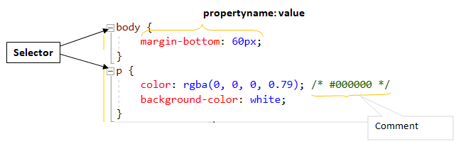
CSS Rule
Selectors point to the HTML elements in the page
Declaration block are surrounded by curly braces, and may contains one or more declarations separated by semicolons (semicolons are optional for the last declaration).
A Declaration consists of a property name and a value, separated by a colon.
In addition to the name selectors, CSS enables developers to select HTML elements based on element's id, class, attribute, and more.
CSS is introduced to HTML in three ways.
- Inline style
- Internal style sheet
- External style sheet
Inline style
Applying CSS directly to an individual HTML element using style attribute
Internal style sheet
Applying CSS to an HTML page using Style element in the page head
External style sheet
Using an external css file and applying css using link element in the page head
How it works
The browser receives the HTML page (URL) from the server, loads and then parses HTML. At the parsing stage, if the CSS is already part of the document (inline css), it creates Document Object Model (DOM). If not, it makes a separate request to the server to retrieve the css file. Then, it loads the CSS and then parses. After that it creates DOM. Once DOM is ready, the browser renders the page (displays the content of the DOM).
DOM
The Document Object Model (DOM) is a programming interface for HTML and XML documents. DOM has an upside-down tree-like structure (leafs are at the bottom) which represents the page as nodes and objects. DOM can be modified with a scripting language such as JavaScript.
More Selectors
In addition to the element selector, which targets all elements with the specified element name, CSS provides many more selectors.The Id Selector
Id selector matches an element based on the value of its id attribute
    <h1 id="main-title">The Main Title of My Page</h1>

    #main-title {
        text-align: center;
        color: red;
    }

    [id=main-title] an be used instead of #main-title
The class Selector
class selector matches elements based on the contents of their class attribute.
    <p class="red-text">paragraph with red text</p>
    <p class="red-text yellow-background">paragraph with red text and yellow background</p>
    <p class="red-text italic-text">paragraph with red and italic text</p>

    .red-text {
    color: #f33;
    }

    .yellow-background {
    background-color: #ffa;
    }

    .italic-text {
    font-style:italic;
    }

    [class~=red-text] an be used instead of .red-text
The attribute Selector
attribute selector matches elements based on the contents of their class attribute.
    /* <a> elements with a title attribute */
    a[title] {
    color: purple;
    }

    /* <a> elements with an href matching "https://cse.unl.edu" */
    a[href="https://cse.unl.edu"] {
    color: red;
    }

    /* <a> elements with an href containing "students" */
    a[href*="students"] {
    font-size: 2em;
    }

    /* <a> elements with an href ending ".edu" */
    a[href$=".edu"] {
    font-style: italic;
    }

    /* <p> elements whose class attribute starts with the word "logo" */
    a[class^="logo"] {
    padding: 8px;
    }
The universal Selector (*)
universal selector (*) matches elements of any type
    /* Selects all elements */
    * {
       color: green;
    }
Combinations of more than one Section
The adjacent sibling combinator Selector (+)
adjacent sibling combinator (+) separates two selectors and matches the second element only if it immediately follows the first element, and both are children of the same parent element.
    <div>
        <p>
            Paragraph before div element
        </p>
        <div>
            Div element
        </div>
        <p>
            Paragraph immediately after element
        </p>
        <p>
            Paragraph after another Paragraph element
        </p>
    </div>

    /* Paragraphs that come immediately after any div */
    div + p {
        font-style: bold;
    }
The descendant Selectors ( )
descendant selectors ( ) matches the elements only if they have an ancestor element matching the first selector
    <div>
    <p>Paragraph before div element</p>
    <div>Div element</div>
    <p>Paragraph immediately after element</p>
    <p>Paragraph after another Paragraph element</p>
    </div>

    /* Paragraphs that are descendants of a div */
    div p {
    font-style: bold;
    }
    /* Paragraph that are descendants of the "students" list. students is a class */
    div.students p {
    padding: 2em;
    }
The child Selectors ( > )
child selectors ( > ) matches the second selector that are the children of elements matched by the first.
    <div class="students">
    <p>Paragraph before div element</p>
    <span>
       <p>Paragraph not a child of div.students</p>
    </span>
    <p>Paragraph immediately after element</p>
    <p>Paragraph after another Paragraph element</p>
    </div>

    /* List items that are descendants of the "students" list. students is a class */
    div.students p {
    padding: 2em;
    }
Pseudo-classes and Pseudo-elements
Pseudo-classes allow the selection based on the state an element.
Pseudo-elements targets a specific part of an HTML element, not the element itself.
    /* Any <a> (link) over which the user's pointer is hovering */
    a:hover {
    color: black;
    }
    /* The first line of every <p> element. */
    p::first-line {
    text-transform: uppercase;
    }
Cascading Order
The notion of cascading in CSS is important to understand. Basically it refers to the hierarchical order in which different style types interact when more than one rule applies to a single element and therefore when conflicts arise. For example: When there is more than one style specified to an HTML element, one setting the background to green and the other setting to red, which style will be applied? The short answer: The rule with higher precedence (weight) will take effect.
The cascading occurs in this order
- Browser Defaults Styles
- User Styles
- External Styles
- Internal Styles
- Inline Styles
Inline, Internal External styles are author styles. Author styles have higher precedence than User Styles which have higher precedence than Browser Defaults Styles.
The higher the number, the higher the precedence. Inline Styles have higher precedence (5) then Internal Styles (4) and so on.
Basically, if two styles come into conflict, the one with higher precedence will be applied and override the other ones. This is often the last one used.
Basically, the closer the css to an element the higher its precedence. In other words, the css that is applied last wins the race. When all other conditions are the same, the inline-css will win and override the internal, external and browser styles.
The inline style has the highest priority, and will override the internal, external and browser defaults styles.
It is important to recognize that this happens only when two contradicting styles are applied to the same HTML element.
Selector Type Precedence
The selector type precedence occurs in this order
- Element
- Class
- Id
When there is an element with a class and Id selector, and they contained conflicting styles, the Id style takes precedence and overrides the class style.
css-selector-type-precedence.html
More than one selector rule may apply to a given element. When this occurs, the browser follows the Specificity rule to decide which rules to apply.
CSS Inheritance
The idea of inheritance is simple: The property values (styles) applied to an element will be inherited by the elements children. Reverse is also true: A child element will take on the property values of the parent element. What if you want the child element to take on some rules of the parent but not others? Developer will simply override the rules that need not to be inherited.
The !important Rule
Utilize the !important rule only to make sure that the most crucial styles are always applied. Use this rule only when necessary. Again, It is important to know that the !important is only useful when two contradicting styles are applied to the same HTML element.
Often when using a framework or someone else's css libraries, you might want to change the basic visual aspect to fit your needs. Instead of making changes to the source file, it's best to override some aspects. This could be done using !important
Styling Text
Styling Text using CSS generally involves two groups
- Font styles
- Text layout styles
Font styles
These are the properties that affect font which is applied to the text. Properties are: color, font name(s), font family, font size, font style, font weight, text transform, and text decoration.
color
    p, .red-text {
    color: red;
    }
font-family
    p .screen-read {
    font-family: arial;
    }
Some fonts are supported by certain computer systems only. The fonts that are supported by all systems are known as web safe fonts.
Web safe fonts
| Name | Type |
|---|---|
| Arial | sans-serif |
| Courier New | monospace |
| Georgia | serif |
| Times New Roman | serif |
| Trebuchet MS | sans-serif |
| Verdana | sans-serif |
CSS divides font family names into generic and non-generic families. Generic names for fonts are serif, sans-serif, monospace, cursive and fantasy.
Non-generic names for fonts are times, courier, arial, and more...
When writing font rules, start with the font that you hope to use, and always end with a generic family for a fall back. There is no guarantee that the fonts you want to use will be supported by the browser, one should always supply font stacks. Separate each name with a comma and if a font name contains white-space, it must be quoted.
    <p class="cool-font"> A paragraph with several font family </p>
    .cool-font {
    font-family: Helvetica, "Trebuchet MS", Arial, Verdana, sans-serif;
    }
CSS Measurements
Developers use various numeric value types when writing CSS code. The following are all classed as numeric:
| Data type | Description |
|---|---|
| integer | An integer is a whole number such as 1024 or -55. |
| number | A number represents a decimal number — it may or may not have a decimal point with a fractional component. For example, 0.255, 128, or -1.2. |
| dimension | A dimension is a number with a unit attached to it. For example, 45deg, 5s, or 10px. dimension is an umbrella category that includes the length, angle, time, and resolution types. |
| percentage | A percentage represents a fraction of some other value. |
Length & Size
There are two types of size used in CSS — relative and absolute
Absolute units
Once set, these units are always be the same size — they are not relative to anything else..
| Unit | Name | Equivalent to |
|---|---|---|
cm |
Centimeters | 1cm = 96px/2.54 |
mm |
Millimeters | 1mm = 1/10th of 1cm |
Q |
Quarter-millimeters | 1Q = 1/40th of 1cm |
in |
Inches | 1in = 2.54cm = 96px |
pc |
Picas | 1pc = 1/6th of 1in |
pt |
Points | 1pt = 1/72th of 1in |
px |
Pixels | 1px = 1/96th of 1in |
Relative units
Relative length units are relative to something else, perhaps the size of the parent element's font, or the size of the viewport. The benefit of using relative units is that with some careful planning you can make it so the size of text or other element scales relative to everything else on the page. Some of the most useful units for web development are listed in the table below.
| Unit | Relative to |
|---|---|
em |
Font size of the parent, in the case of typographical properties like font-size, and font size of the element itself, in the case of other properties like width. |
ex |
x-height of the element's font. |
ch |
The advance measure (width) of the glyph "0" of the element's font. |
rem |
Font size of the root element. |
lh |
Line height of the element. |
vw |
1% of the viewport's width. |
vh |
1% of the viewport's height. |
vmin |
1% of the viewport's smaller dimension. |
vmax |
1% of the viewport's larger dimension. |
By default, the font-size of an element is inherited from that element's parent element; however developers have the ability to override this behavior. Font-size can be set using one of these units: px, em, rem
px which is an absolute unit, represents the number of pixels high for the text. This value does not change when screen size changes
em is a relative unit. 1em is equal to the font size set on the parent element. When the size of the parent element changes, so does the font size of the current element.
rem is a relative unit. 1rem is equal to the font size set on the root element of the document which is html.
Not all browsers support relative units.
Font Styles effecting Text
font-style set the text to one of these fonts: normal, italic, oblique
font-weight set the text's boldness: normal, bold, bolder, lighter, numeric values: 100–900
text-transform sets text transformation: none, uppercase, lowercase, capitalize, full-width
text-decoration sets text decorations: none, underline, overline, line-through
Text Shadows
CSS has the functionality to add shadow to text.
    <p class="with-shadow"> A paragraph with Text Shadows </p>

    text-shadow: h-shadow v-shadow blur-radius color|none|initial|inherit;

    .with-shadow {
    text-shadow: 4px 4px 6px green;
    }

    Multiple shadows
    ----------------
    text-shadow: -1px -1px 1px #ddeeff,
    0px 4px 1px rgba(0,0,0,0.5),
    4px 4px 5px rgba(0,0,0,0.7),
    0px 0px 7px rgba(0,0,0,0.4);
h-shadow and v-shadow are required
Text Styling
CSS provides several properties for text layout and styling. Below are some of the most commonly used properties. For a complete list, check online.
text-align property is used to set alignment of the text within its container. This property works the same way as any regular word processor. Possible values are left, right, center, justify
line-height property sets the height of a line of text
letter-spacing property sets the spacing between letters in the text
word-spacing property sets the spacing between words in the text
word-wrap tells the browser to break lines within words
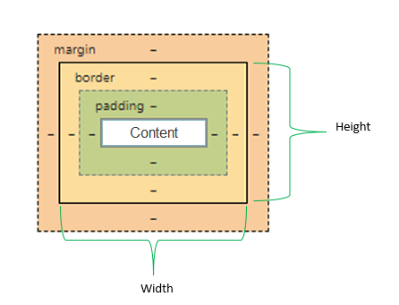
The Box Model
Every HTML element will produce a rectangular box. Each box includes content, padding, border and margins. Understanding how to size and arrange the boxes is a critical step toward understanding web design.
CSS Box Types
CSS provides many types through display property. The basic ones are block, inline, inline-block.
In the Layout section, we will talk about a few more such as flex, table-row and grid.
block which is the default display property of most elements, set the element to display as a block. Blocks stack on top of each other.
inline is the opposite of a block box. Its content breaks with the flow of the text.
inline-block flows with surrounding text and other inline elements without creating line breaks before and after. This is something in between block and inline.
css-display.html (display and visibility)
Box Properties
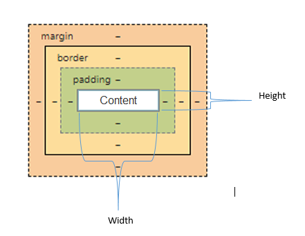
width, height properties set the width and height of the content box as seen in the image above
padding property sets the space between content and the border of the element
border property sets the style of the border. Adds space between padding and margin.
margin property set the space around the element.
Better Box with box-sizing
box-sizing alters how the total width and height of a box is calculated.
CSS Layout
CSS provides several techniques for creating the desired layout. In this chapter, we will start with reviewing the basic normal flow of elements in the page. Element positioning, relative to the parent element as well as the document, will give us the opportunity to move elements to a different location in the page. Floating content, which was very popular in the past, will enable us to wrap block level elements to move left or right for creating magazine like content. Most importantly, we will cover table layout, flex layout and grid layout.
The browser will stack the block level elements on top of each other, by default, this is also known as normal flow. There is no css to effect the positioning of any element. The position of an element is, by default, static.
Element Positioning
Using positioning, one can take HTML elements out of normal document flow, and make the display differently. Elements can be positioned in different location relative to the parent element, the document and the window. Position may be altered for each screen size as well.
    selector {
        position:value;
    }
static is the default position. In other word, no position is applied. The element is positioned according to the normal flow of the document
relative moves an element from its default position in some direction.
absolute and fixed removes the element from flow of a document.
fixed moves an element to a specific position relative to the windows (not the document). Scrolling will not affect the visibility.
absolute and fixed removes the element from flow of a document.
The element is positioned according to the normal flow of the document, and then offset relative to its nearest scrolling ancestor and containing block (nearest block-level ancestor), including table-related elements, based on the values of top, right, bottom, and left.
position: -webkit-sticky;for webkit. Check out caniuse.com for availability of stick in your browser
Display Property
In the CSS Box Types section we have already covered the basic display properties such as block, inline, inline-block, and none. Before we move on to more advanced display properties, we will demonstrate float which is not a display property, however float its being used for layout as well.
float is used for wrapping images inside blocks of text. It can also be used for layout: sections of the page may be floated left or right. Once an element is floated, it affects all the block level elements that follow it in normal flow. In order to make sure the following elements follow the normal flow, developers often clear the float.
.clearBoth {
        clear:both;
    }
Advanced display properties: flex, and grid
Before we start with modern display properties, it is worthwhile to mention that display: table was quite popular for a long time. Table layout is designed for laying out 2D data in a tabular format. While it's still widely used, it is considered a legacy layout method.
Flexbox or flex layout
Flex or Flexbox layout was introduced for laying out more complex applications. In its core, it's similar to block layout with many flexible options. Often, the container is known as the flexbox and is one-dimensional. Items in the flexbox, may be laying in rows or columns, and flex to fill available space and shrink to fit into smaller spaces.
CSS community used float, positioning and table to generate desired layouts for years. These worked for the majority of the developer community however these options were not designed for an intuitive layout. Flexbox enhances the notion of layout in several ways - the list below is a subset of what flex introduces:
- Specifying the direction that content may be laid out
- Vertically centering a block of content
- Ability to layout as a single line or multiple lines
- Making all the children of a container take up an equal amount of the available width/height, regardless of how much width/height is available
- Making all columns in a multiple column layout adopt the same height even if they contain a different amount of content
- Ability to dynamically collapse or uncollapse
CSS Grid Layout
Before flex (or flexbox) was available, developers were using tables, display:inline|inline-block|block|table, float and many other positioning hacks to achieve desired layouts.
Flex solved a lot of issues related layout and brought easy notion to manage layout using CSS. However, it turned out that flex had its own short comings.
Flex provides a layout method for one-dimensional layout. One-dimensional means that you may lay out your content in a either row, or column, but not both, unless you use css rules beyond the scope of flex.
The CSS community searched for something better and came up with CSS-Grid. CSS-Grid is for two-dimensional layouts. Rows and columns both can be utilized. When there is only one row or one column container, it will behave as flexbox substitute.
There has been two levels of specifications since the inception of CSS-Grid. CSS Grid Layout Module Level 1 is W3C Candidate Recommendation while
CSS Grid Layout Module Level 2 is W3C Working Draft
According to Can I Use, CSS-Grid has over 90% of the support among the major browsers already.
Grid Terminology
Think of Grid as Table
Grid Lines are the lines that make up the grid. These can be horizontal or vertical. We can refer to them by number, or by name.
Red line on this table is column line 2
Grid Track is the space between two Grid Lines, either horizontal or vertical
Grid Track on this table is between row lines 6 and 7.
Grid Cell is the space between 4 Grid Lines. It is the smallest unit on the grid that is available to place an item.
Grid Cell on this table is between row lines 4 and 5 and column lines 3 and 4.
Grid Area is any area on the Grid bound by four grid lines. It may contain a number of Grid Cells.
Grid Area on this table is between row lines 1 and 5 and column lines 5 and 7.
Now that we are familiar with the basic terminology, let's define the grid layout and what it can do. A grid is basically a pattern of regularly spaced horizontal and vertical lines forming squares on a surface. CSS grid enables us with a pattern against which we can line up our html elements. A grid will typically have columns and rows.
.container {
                display: grid;
            }
After turning our container into a grid, we can add columns and rows. We can specify the size of each cell to be different or we can choose to have a flexible grid that has all cells the same size. Pixels (px) or percentage can be used when the size of cell are defined. Grid introduces a new unit, fr, which is for flexible size grid rows and columns
.container { display: grid; grid-template-columns: 1fr 1fr 1fr; /* or 100px 100px 100px; */}CSS Grid Examples
What About Mobile Devices?
I want to use my phone
Responsive Design
WhatIs.com describes Responsive design as follows: Responsive design is an approach to web page creation that makes use of flexible layouts, flexible images and cascading style sheet media queries. The goal of responsive design is to build web pages that detect the visitor's screen size and orientation and change the layout accordingly.
The above description introduces new terminology such as media queries and also the last sentence mentions "visitor's screen size and orientation". In other words, this sentence suggests that CSS should be able to detect "visitor's screen size and orientation" and supply separate CSS rules. Such a solution is made possible by media queries.
Introduction to Media Queries
Media Queries enable developers to apply a subset of CSS rules to the HTML document. It uses the @media to specify a certain condition such as screen resolution (i.e phone screen or tablet screen or computer screen). These conditions are made of media type in conjunction with size information. Often, this is known as breakpoints which are the point at which the page content will respond to provide the user with the best possible layout to consume the information.
@media condition { /* Apply this rule, only of the condition is true */}Below is a list of commonly used media types
- all (suitable for all devices)
- braille
- embossed
- handheld
- projection
- screen
- speech
- tty
- TV
Here, we used min-width. We can also use max-width as well.
Mobile First
min-width is used for taking the smallest device into consideration first. CSS for mobile devices will be rendered first, then CSS for larger ones will override. This makes sense because smaller devices often have limited processing power. When there is less CSS, the page will load faster. This is used as a performance trick and is a best practice
However, often developers omit following the Mobile First approach. The flip side is using max-width. This approach largest device into consideration first. CSS for mobile devices will override some of the CSS for proper display in the smaller devices. In this case, smaller devices will apply the CSS written for the larger devices, then apply the CSS written for the smaller devices. This will require more processing and delay in document load. This practice is widely used, but not a good method for performance considering more users access web using mobile devices than PCs.
Vertical Three Sections
Putting all together
CSS Frameworks
Over the years, the developer community learned, documented and come up with easy ways to manage CSS. Developers created CSS independently and maintained their own CSS code. This continued for years. It turned out that most developers wanted to create similar layouts, also some developers found CSS cumbersome because CSS was not a programming language like C, C#, Java. CSS frameworks came to rescue to allow for easier, more standards-compliant web design.
The two widely used frameworks are Bootstrap and Foundation. More can be found online
Using auto value in CSS properties
The use of auto value varies from a property to another. It should be understood within the context of each property.
width: auto
|
When an element has auto as a value for width, it can have margin, padding, and border without becoming bigger than its parent element.
The default width of block-level elements like div or p is auto, which makes them take the full horizontal space of their containing block.
Changing the width to 100% instead of auto will take 100% of its parent, plus the margins on the left and the right sides.
|
height: auto
|
The height of an element is equal to its content where the default value is auto.
For height, the auto and 100% settings produce the same outcome.
|
margin: auto
|
Generally, developers will consider top and bottom margins together; and left and rigt margins together.
Example: When an element has auto as a value for margin-left and margin-right,
the element will take equal amount of availble space, divide between left and right.
This will center the element in it's parent. Setting margin to 100% has no meaning.
By default, block level elements are stack on top of one another with virtually no (space) space
and inline elements are arranged next to one another with virtually no (space) margin
Using auto margins with flexbox can be very useful in some use cases.
When a child item has an
.parent {
    display: flex;
}

.item-two {
    margin-left: auto;
}
It works in the both horizontal and vertical directions. |
flex with auto
|
Using flexbox (setting the
    .item {
        flex-grow: 1;
        flex-shrink: 1;
        flex-basis: auto;
    }
Meaning:
|
CSS Grid and auto
|
Setting an
Grid introduces a new length unit,
|
CSS Transitions
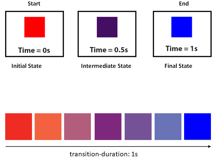
By default, changing CSS properties take effect immediately however CSS transitions provide a way to control animation speed when changing CSS properties. In other words, using transitions we can control when the changes will take effect over a period of time. For example, if you change the gackground-color of an element from red to blue, usually the change is instantaneous. Using CSS transitions, changes occur at time intervals that follow an acceleration curve, all of which can be customized.
Not all properties can be animated. Click the Animatable CSS properties for the list of properties that can be animated.
CSS Transitions are controlled using the following properties.
-
transition-property - Specifies the name or names of the CSS properties to which transitions should be applied
The value may be any property that accepts numeric type. The default (initial value is all)
Value: none | all | color | background-color | opacity | height | width | left | top | . . .
Initial: all
-
transition-duration - Specifies the duration over which transitions should occur
Value: <time>
Initial: 0s
-
transition-delay - Defines how long to wait between the time a property is changed and the transition actually begins.
transition-delay is optional
Value: <time>
Initial: 0s
-
transition-timing-function - Specifies a function to define how intermediate values for properties are computed
transition-delay is optional
Value: ease | linear | ease-in | ease-out | ease-in-out | step-start | step-end | steps | cubic-bezier | . . .
Initial: ease
The shorthand transition property combines all four properties and is the best way to configure transitions, as it makes it easier to avoid out of sync parameters, which can be very frustrating to have to spend lots of time debugging in CSS.
- transition: transition-property transition-duration transition-timing-function transition-delay;
Examples will proof that assigning values to each property is straightforward however the property transition-timing-function deserves explanation. transition-timing-function specifies timing functions to define how intermediate values for properties are computed. and how intermediate values of the transition are calculated. Commonly utlized values for transition-timing-function are as follows
    Commonly utlized values for transition-timing-function
    /* Keyword: values */
    transition-timing-function: ease;
    transition-timing-function: ease-in;
    transition-timing-function: ease-out;
    transition-timing-function: ease-in-out;
    transition-timing-function: linear;
Click on Easing Functions for the full list.
CSS Transform
The transform property allows us to translate (move), rotate, scale, and skew an element. It modifies the coordinate space of the CSS visual formatting model. Below is the list of transform properties
translate()rotate()scaleX()scaleY()scale()skewX()skewY()skew()matrix()
CSS Animations
CSS animations make it possible to animate transitions from one CSS style configuration to another. The end result may look and feel the same as css transition however, animation provides more control over how the states are animated.
Animations consist of two components
- A style describing the CSS animation
- A set of keyframes that indicate the start and end states of the animation’s style, as well as possible intermediate waypoints
The style describing the CSS animation
There are two main purpose of the style describing the CSS animation
- Provide css code for animation.
- Assign the @keyframes to the elements which will be animated.
Keyframes
Keyframes defines how the animation will perform at each stage of the animation timeline
Every keyframe has the follwoing 3 components
- Name of the animation which is offten descriptive, such as fadeIn
- Stages of the animation which represented as a percentage. 0% represents the beginning state of the animation. 100% represents the ending state of the animation. Multiple intermediate states can be added in between.
-
CSS Properties to specify changes at stage of the animation timeline
As in CSS transition, the shorthand animation property combines all all properties and is the best way to configure transitions, as it makes it easier to avoid out of sync parameters.
The Essential properties for animation are as follows
- animation-name Specifies the name of the @keyframes
- animation-duration Shapes the length of time that an animation should take to complete one cycle.
- animation-timing-function specifies how the animation transitions through keyframes by establishing acceleration curves.
- animation-delay Sets the delay between the time the element is loaded and the beginning of the animation sequence.
- animation-iteration-count Sets the number of times the animation should repeat, May be set to infinite which will repeat the animation indefinitely.
- animation-direction Specifies whether or not the animation should alternate direction on each run through the sequence or reset to the start point and repeat itself.
- animation-fill-mode Sets values that are applied by the animation before and after it is executing.
- animation-play-state Provides the ability to pause and resume the animation sequence.